
Eyewitness
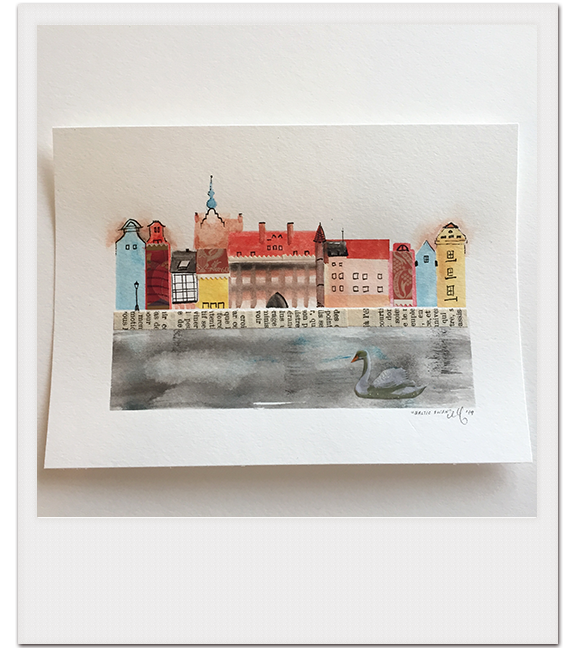
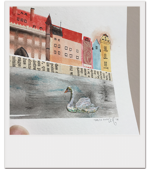
Last Christmas, I created a miniature, mixed-media piece of Gdańsk, Poland, for a former resident who missed the swans that swam in the Baltic Sea. (Coincidentally, my brother also lived in Poland and said that Gdańsk was the prettiest city in the country—and he remembered the swans, too.) The night I finished it I was not only enamored with Old Town's jovial, waterfront skyline but found myself thanking the Lord for color in my bedtime prayer.
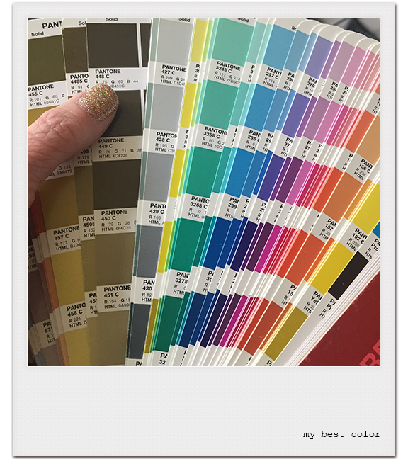
I'm serious about loving color. As a designer, I probably think about color more than most people do, and can therefore be offended about color in ways most people can't. For instance, if you google "What is the ugliest color?" this comes up:
Pantone 448 C, also referred to as "the ugliest color in the world", is a color in the Pantone color system. Described as a "drab dark brown", it was selected in 2012 as the color for plain tobacco and cigarette packaging in Australia, after market researchers determined that it was the least attractive color.
Pantone 448 C is one of my favorite colors to wear (it's so rich, and the green tones really enhance my hazel eyes), so I prematurely crossed VISIT AUSTRALIA off my bucket list for obvious reasons.
Anyhoo, not one week after delivering the Gdańsk piece, my friend Keith and I were conversing about wildflowers and he mentioned color was one of the reasons he believed in God. I knew exactly what he meant.
Start with the million variations of light in the sky, from world-on-fire sunrises to cotton candy sunsets. The heavens are majestic—no two ways about it. (Let's be honest, I mostly see sunrises the few mornings after DST when my body is tricked into being a morning person, or if I forget to lower the shades and henceforth wake from a morning beam lasering through my eyelid.) I never take pictures of skies because my eyes beat an iPhone 6. When I compare what I'm seeing in the living, breathing moment to the capture on the screen, I am doubly thankful for the gift of vision.
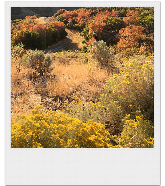
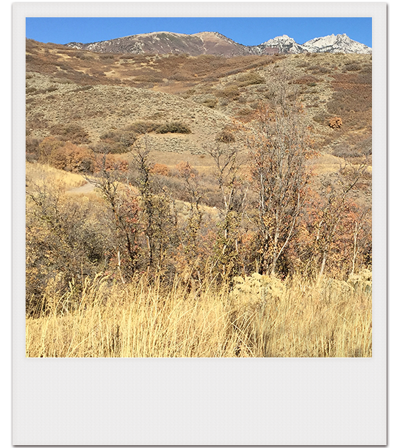
What are the odds that every blade, leaf, and petal on the mountain have their vibrance sucked dry by autumn’s dementors and all that remains is a wheat tortilla landscape the exact color of deer fur? Leopards in savannah grass, mountain hares in snow, moths on tree bark, copperhead snakes in piles of leaves—there’s just no way a big bang generated that kind of intentional design. I’m certain the Creator arranged camouflage.
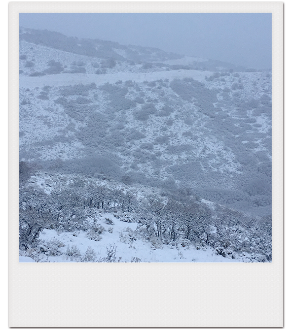
I love the Ansel Adams aftermath of winter storms, when my eyes truly can’t tell if they are seeing in black and white or color. (The only giveaway is the slightest hint of blue in the air.) A monochromatic world is especially still; I tiptoe through its divine freeze-frame.
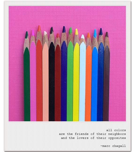
How about that Chagall quote? Truth is truth, and there is truth spinning through the color wheel, aka The Non-Accidental Guide to Human Relationships.
Pretend you are the color Red. (I'm capitalizing colors now since they represent people. Okay?)
Red’s complement, or opposite on the wheel, is Green. They have nothing in common, yet Red and Green boldly highlight each other’s virtues and make each other complete. Think Christmas amaryllis, ripe tomatoes on the vine, and long-stemmed roses—but also think of that person you snap judged with strong dislike that became one of your BFFs. Every yin needs a yang, and every Red needs a Green.
Red’s analogous tribe includes next-door residents Red-orange and Red-violet. Analogous color schemes include three consecutive colors on the wheel and occur most often in nature—they are harmonious, serene, and comforting. The world is scary enough; build a padded cocoon of serenity around yourself with neighbors you can share your keypad code, yummy leftovers, and summer nights with.
Red’s triadic buddies are Yellow and Blue. Equidistant from each other on the wheel, this troupe is a noisy bunch who proves balance can be struck within competitive diversity—even when someone is dominating the group. Does anyone have a family that feels…triadic? Take heart—there really is room for everyone in social decorating.
You don’t have to take a semester of color theory to see that God is trying to teach us something about human harmony through color harmonies. If Red can absolutely, positively pair with anybody on the color wheel (and look smashing while doing it), every other color can, too!
We were all made for each other.
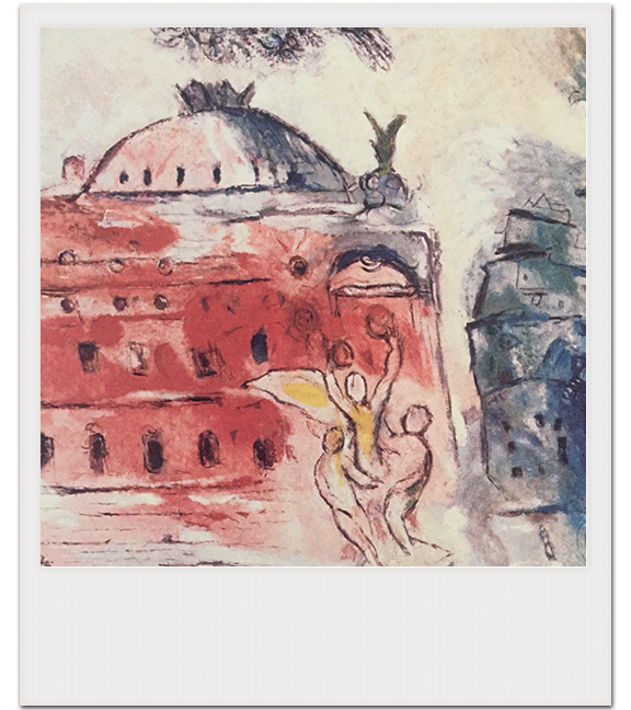
I was indifferent to Chagall until I saw the ceiling of the Opera Garnier. Those reds made me audibly gasp and the whole fresco sold me on choosing a triadic primary color scheme for The Chateau. I love me some red, yellow, and blue.
I'm also sad annually when Greg and my boys refuse to indulge my Halloween fantasy of letting us be CMYK for a family costume. I know only designers would get it, and as the designer I'd have to be K, but I'm not giving up. I gave up on being the Berenstain Bears, though. Another story.
One last color tidbit:
Crayola has been around since 1903. 1903!!! Now, I'm a coupon clipper and a budgeter but there are a few items I cannot go generic on and Crayola crayons is one of them (the others being Skippy peanut butter and Honey Maid graham crackers). Crayola crayons are the scent of my childhood happiness and I love them in any quantity, from pocket-sized 8-count to giant box of 120. Some people want to name a star, but the wish of my heart is to name a Crayola crayon. Crayola has the best names and I want to be in the Crayola League, if not the Hall of Fame. Some of my personal favorite crayon names are "Manatee", "Macaroni and Cheese", "Inchworm", and "Purple Mountain's Majesty" (for Greg, who never shirks from telling people "America the Beautiful" was written atop Pikes Peak, the mountain he grew up next to). Three years ago, Crayola retired their yellow "Dandelion" crayon and filled its vacancy with "Bluetiful", which won the "Name the New Blue Crayon" contest. I don't know when Crayola's next contest is but I'm chomping at the bit to contribute. This is how I can leave my mark in history.